Project Overview:
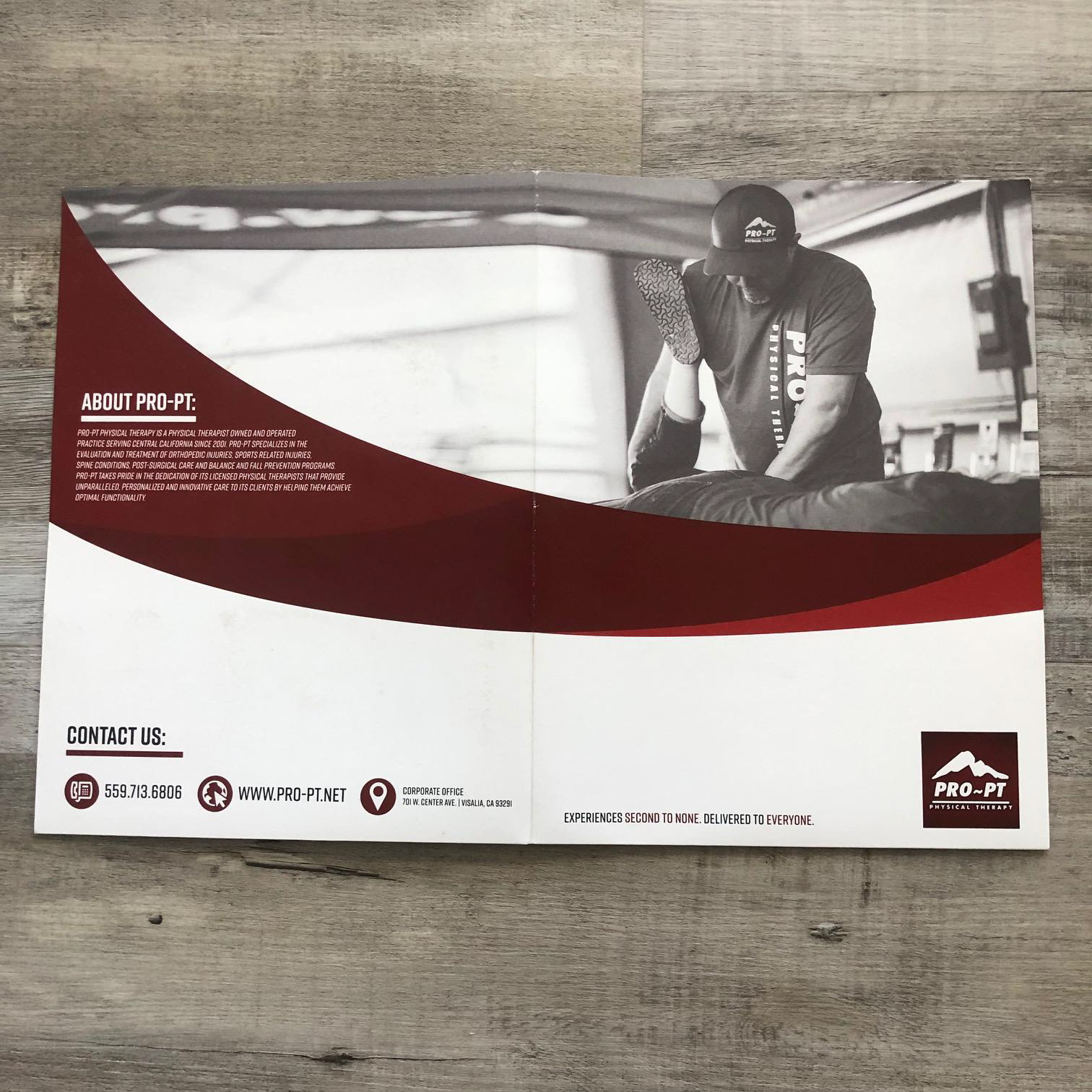
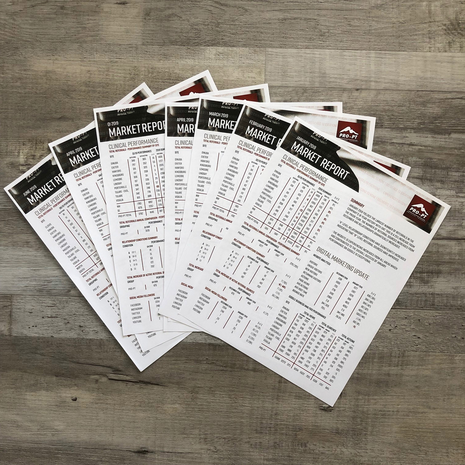
I had the privilege of leading the identity rebrand for PRO-PT Physical Therapy, a project aimed at refreshing and modernizing the brand to better reflect its values and services. This rebrand included new photography of the therapists and a revitalized color scheme featuring bold PRO-PT red, complemented by black, white, and gray tones. This new look was implemented across all marketing materials network-wide, significantly enhancing the overall aesthetic and professional feel of the organization. The new brand identity was applied across all marketing materials, both digital and print, ensuring a consistent and professional look throughout the network. This included updating the website, social media profiles, brochures, business cards, and office signage.
I had the privilege of leading the identity rebrand for PRO-PT Physical Therapy, a project aimed at refreshing and modernizing the brand to better reflect its values and services. This rebrand included new photography of the therapists and a revitalized color scheme featuring bold PRO-PT red, complemented by black, white, and gray tones. This new look was implemented across all marketing materials network-wide, significantly enhancing the overall aesthetic and professional feel of the organization. The new brand identity was applied across all marketing materials, both digital and print, ensuring a consistent and professional look throughout the network. This included updating the website, social media profiles, brochures, business cards, and office signage.
The Creative Rebranding Strategy:
The rebranding strategy for PRO-PT focused on creating a bold, contemporary visual identity that conveys strength, professionalism, and approachability. I directed the creative team to use a consistent and cohesive color palette and updated photography to create a unified brand image.Photography played a crucial role in the rebranding process, helping to humanize the brand and highlight the expertise and dedication of PRO-PT’s therapists. I also guided the photography team to capture authentic, high-quality images of the therapists in action, interacting with patients, and working in various therapy settings.
Outcome:
The identity rebrand for PRO-PT Physical Therapy has significantly improved the overall look and feel of the organization. The fresh, modern design and updated photography have helped to enhance the brand’s professional image and appeal. The cohesive application of the new brand identity across all marketing materials has strengthened PRO-PT’s presence in the market, fostering greater recognition and trust among clients and stakeholders.
This project highlights my ability to lead a comprehensive rebranding initiative, combining design, photography, and strategic marketing to create a powerful and cohesive brand identity. The PRO-PT rebrand stands as a testament to my expertise in creative direction and brand development, making it a proud addition to my portfolio.


